Painting Process Step By Step – Part 1
November 27, 2020
Painting For Beginners – The Keys To Learning To Paint
December 7, 2020This is part 2 of our article looking at the typical painting process step by step that I go through with my more finished works.
- Follow this link for Part 1 – Painting Process Step By Step Part 1
- Follow this link for Part 3 – How To Critique Your Artwork
Part 1 of this article took us through the painting process using the Moore Method of Painting. In part one we go to the end of the second step of the Moore Method of Painting which was the block in step. If you have not read part one then we recommend doing so first then coming back here.
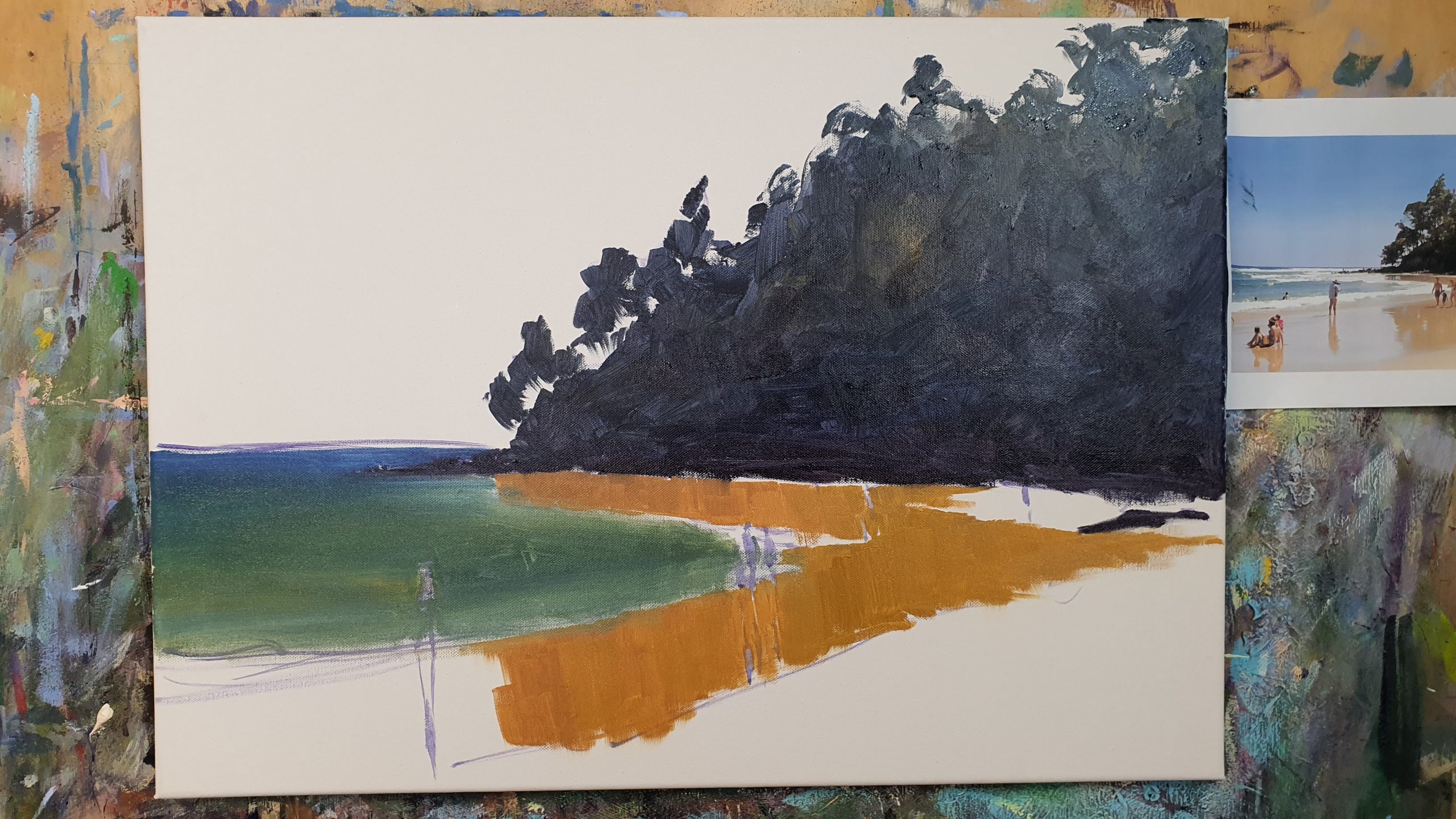
Assessing Our Progress
I left the painting overnight to dry a bit when I had finished the block in step. Here is how it is looking:

As you can see the painting is successfully blocked in. At this stage it should look a little blocky and unrefined.
The main objective is to get our composition and design right, with the right shapes, and to establish our values pattern.
Before starting step 3 of the Moore Method of Painting though we want to do a quick assessment to see what is working and what needs to be adjusted. We are better off doing any adjustments before we get too far into the next step.
There are two things I decided I wanted to adjust with this one. Both of them have to do with big shapes:
- The shape of the overall water mass is the most obvious thing I wanted to adjust. by comparison with the reference photo I had opened up the water shape too much. So I decide to move the line where the water meets the sand higher up.
- The second thing I decided to adjust is the wet sand. I wanted to bring it down lower in parts
Overall I was happy with everything else so it was on to step three.
Step 3 – Refinement
Step 3 of the Moore Method of Painting is the refinement step.
This is where we start to add middle tones, highlights and details. Remember our block in is focused on the shadow side or each element, or the dark tones.

My first point of focus was in developing the foliage in the headland. This means starting with mid tone greens. You want to be careful getting to the highlights to early. Its better to build up to them.
To mix the greens I use a combination of the Ultramarine Blue & Yellow Ochre. And I started to add in the Pthalo Green and Lemon Yellow to get the brighter more saturated greens.
Usually I will mix out a range of greens on the palette before starting to paint out the foliage.

I start painting out the foliage with the darker version on the green and then get progressively lighter.
Note – You want to keep in mind where the light is coming from as this will determine the placement of the dark to light greens. In this case the light was rising up behind the headland so I used the lighter green in the areas getting the most light through.
As you can see in the progress photo above you don’t need much of these greens to start to form the illusion of trees and foliage.
Important – Do not overdo it! Too often I see beginners get carried away with this step and completely paint out the darks. The darks (which we placed in the block in) are a vital part of creating form and shape in the elements of a landscape.
With the foliage starting to work on move on to the water.

In the photo above I have moved the water line up. As it was oils and still wet I was able to take a palette knife and scrape back paint first.
Then I painted in more of the sand colour to raise the water line up. The angle is looking better for my eye and happier with it.
I have also added some highlights to the rocks.
The rocks are basically a brown colour which is easy to mix. Just mix up an orange with Alizarin Crimson and Yellow Ochre then progressively add Ultramarine Blue until it goes brown. That’s the tone I blocked the rocks in with.
To get the highlight colour for the rocks use the same mix but lighten it off with white. Then warm the mix slightly with a bit of Alizarin Crimson and Yellow Ochre.
Again be mindful of the direction of light when placing highlights.

In the progress photo above I had developed the water further.
This involved adjusting the colours to make them more interesting in the water. You want to avoid having one flat colour in a large area like the water. So I have added some of the sky colour in, different greens, and yellow greens towards the shoreline.
These additional colour notes add to the visual effect of the water and make it more appealing to the viewer.
Using a palette knife I have used straight Titanium White to build up the white foam water and breaking waves.

Oil On Canvas 20″ x 28″
By Rod Moore
The final stages are focused on details.
Firstly developing the people a little more is the first step. I am not really trying to paint people as such. Just shapes and colours that give the impression of people.
As a result of painting the people in I have some tidy up work to do. The best way to tidy up edges with things like people is to repaint the background around them and use the background to shape them as you want them.
So I mixed the wet sand colour again, Alizarin Crimson & Yellow Ochre with a pin head of Ultramarine Blue. I repainted most of the wet sand area to strengthen it and to shape the figures.
In the last stage then I used a rigger brush. This is a long thin brush that is ideal for doing lines and dots and dashes. This only comes out at the end though 🙂
In go some hints of tree trunks, smaller rocks and pebbles on the sand and so on. Last minute touches but be careful not to overdo them.

Overall I was happy with the end result. Its a good representation of Noosa Beach and would look great hanging in someone’s home. “Noosa Beach” is a keeper so I have listed it for sale.
Note – In step three of the Moore Method of Painting it is good to slow down be more particular about each brush stroke. I am a lot more carefree in the block in phase as long as I have the composition right and the shapes. But as I move into the third steps I do tend to slow down and consider each mark I make. Step three is about refinement. If you have done steps one and two correctly then you will know exactly what to do for step three.
Key Takeaway Points From This Step By Step Painting Process Explanation
Here are some of the key takeaway points to note:
- The reference photo was just one of many I took that morning. Notice how I framed the shot so that the composition is already worked out before we event start.
- Before we started painting we took some time to analyse the subject. In particular I looked for the big shapes and their placement, along with the underlying values structure.
- I’ve used a limited palette which has led to the painting having a feeling of colour harmony and unity overall.
- I only used a handful of brushes through out the process
- The painting was completed following the structured process we teach in the Moore Method of Painting
- The big shapes were identified and placed in the correct place on the canvas
- During the block in phase we use thinned down paint.
- We block in from our darkest darks through to our lightest values. By doing so we establish a values structure. In this case the darkest shape was the headland and lightest the sky and sand
- Once the block in was complete I let it sit overnight to dry off a bit. This gave me a chance to see it with fresh eyes the next day.
- Before starting into step three I did a quick check and realised I was not happy with the shape of the water mass or the wet sand. So these need to be adjusted before getting too far into the refinement stage
- After working on the figures I use the background wet sand to tidy up the shapes of the figures.
- Right at the end I add a few details with a rigger brush. I add in tree trunks, dots and dashes and so on.
That wraps up this second part of this article. In the third part I will walk through the process of doing a critique of your own work.

Download Your Free eBook
Enter your email below to download the free eBook 'Keys To Improving Your Painting' ... plus the free video series!


I like this painting very much Rod. Need lesson on figure painting.
Thanks Midge glad you liked it 🙂
I don’t mean you need a lesson on figure painting I mean I do. That didn’t sound quite right.
🙂 All good I knew what you meant. We have a course on figure painting in the Learn To Paint Academy https://learn-to-paint-academy.teachable.com/p/painting-people/
Excellent method that quickly gives shape and tone to the painting. Thank you for sharing
Thanks Barbara 🙂
Your methods have really helped me with my paintings. I particularly like the limited palette. It helps to create harmony.
Great to hear its helped you Christy. Yes learning to mix paint with a limited palette definitely creates greater harmony.
Love this painting Rod, I will definitely have a go at it!
Glad to hear you love it Jenny. Enjoy painting it
That should be Jenny, not Jenn!
I really like your step by step method of teaching. I am a beginner and it makes sense to
Me and helps me to learn. Thank you for sharing this with me and also sharing your palette because I still have along way to go with color.
Thanks Kathy I am glad you found it useful. Thanks for reading