New Episode of Learn To Paint TV Now Online
February 20, 2018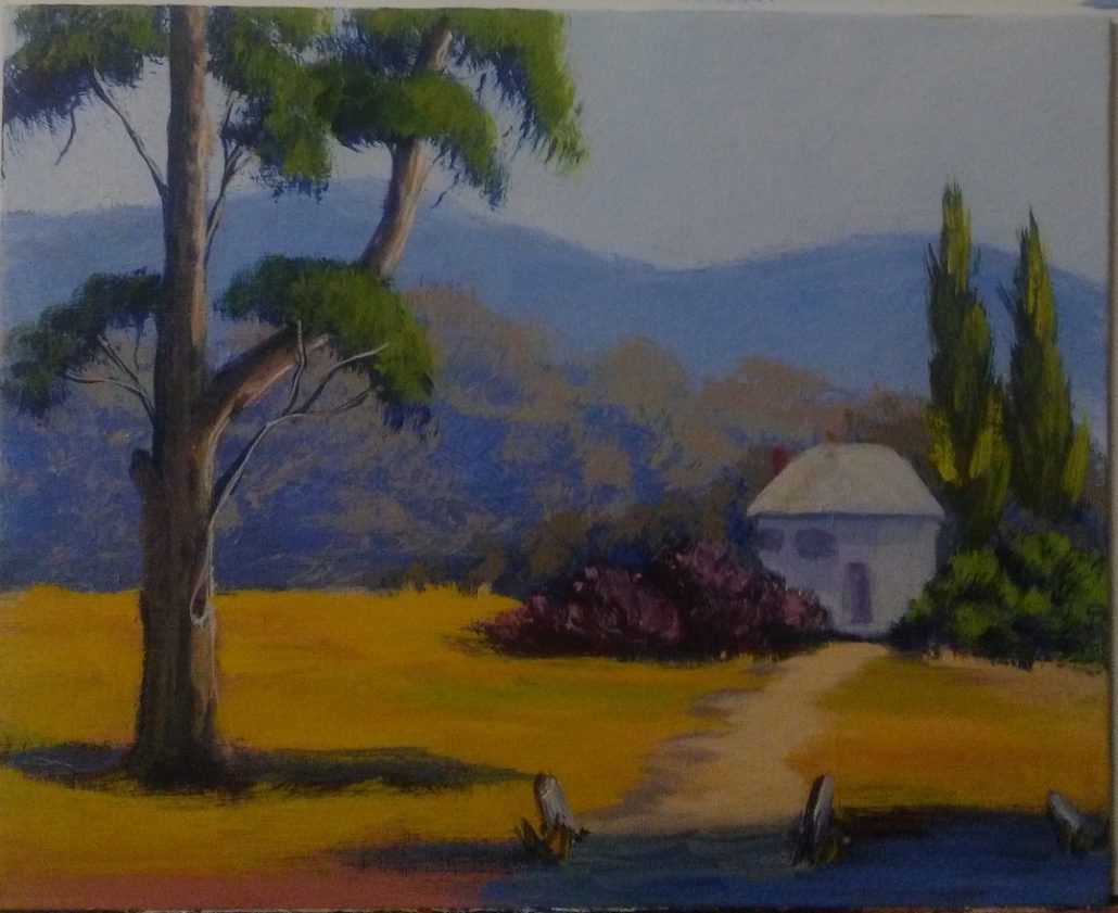
New Student Painting
April 16, 2018How To Paint An Australian Landscape
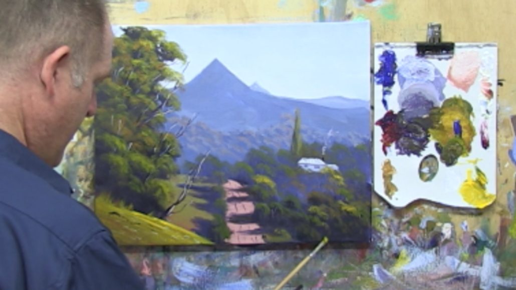
In this article I am going to break down for you step-by-step the process for the painting ‘The Road To Mullumbimby“.
You can watch the episode from Learn To Paint TV here – Click Here To Watch Episode. To download the full length version of this project in high definition follow this link and look for Episode 2 – Follow This Link To Download
The painting is being done on a 16″ x 20″ stretched canvas.
I will be using Atelier Interactive Acrylic Paints. These are professional quality and are the best acrylic paints I have used.
The palette I use is really simple. I like to keep to a limited palette of Ultramarine Blue, Permanent Crimson (or Alizarin Crimson), and Yellow Ochre. They are my three primary colours. To these I add Titanium White and use Cadmium Yellow Medium (or light) to punch up my highlights.
All the other colours are mixes. If you are unsure how to mix colour then follow this link – How To Mix Colours For Artists

I begin by finding the key elements in the photo. This is a reasonably complex photo so you will want to take your time with it.
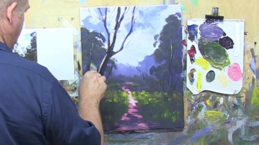
Remember in the Moore Method of Painting our first step is to draw in our big shapes. I mix some Ultramarine Blue and Permanent Crimson together with some water. This is the colour I use for mixing. With a small flat bristle brush I start to mark key points for the main shapes.
Always try to simplify a complex photo down into the main big shapes. At this stage we want to ignore details. The key here is to start the painting off in the right way by placing the main shapes in the right place on our canvas.

As the main feature in the painting is the peak of the hill I work on getting this in early. All the other elements in the painting will work to support this. Notice I have the peak slightly off center. From a composition point of view it works better to not have your main center of interest on the center lines.

My next job is to map in the distant row of trees.
Do not try and draw in every leaf or branch here. I just draw a squiggley line to represent where the top of the tree line will go. I have also put in a small rectangle for the location of the house that is in the painting.

I continue you on adding in indications for the middle distance trees. Note i have drawn in the location of the road as well.
Keep adding water to your mix for the drawing stage. You want the paint to be thin here so it doesn’t show through later on in the painting.
Also be aware that I am not trying to draw a master piece here . Just finding the locations of the big shapes. Always keep this in mind. Keep it loose and fresh.

Now we move to Step 2 of the Moore Method of Painting. This is the block in step.
During this step our goal is to block in colour and establish our values structure.
Above you can see I have mixed up Ultramarine Blue with Titanium White. I am going to use this to block in the mountains first. As they are of in the distance you will want to reduce the saturation of the paint. As objects get further away in the distance they grey of, so the colour is less saturated.
You can easily achieve this by greying the mix down. To do this add just a pinch of the other two primary colours to it. so to Ultramarine Blue you can add the Permanent Crimson and Yellow Ochre. Just a pinch of the other two though.

As you can see above I am blocking this light blue grey colour into the main mountain.
It is quite a light value. This is important. You don’t want it to be as light as the sky will be, however it has to be light enough that we can darken the values as come forward in the painting.
I am using a larger flat bristle brush for this. When you have big areas to cover with paint use a big brush.

The middle distance row of trees are closer to us. So we want to darken the value.
This means a little less white in the mix. I added more Ultramarine Blue and Permanent Crimson. If you look at my palette you will see I keep mixing the darker values over the previous mix, however I save a little of the previous mix so I can compare the values.
I block this new mix in fairly loosely. No need to fuss with it. Use a variety of brush strokes.

Again we move forward in distance in the painting so we again darken the mix. Its easy to do just add more Ultramarine Blue and Permanent Crimson to the mix. Don’t add any more white unless you need to, but if you do add just a little at a time as it can easily over power your mix.
Once again block it in loosely.

Once more we come forward and darken the value. Follow the same procedure as before. See how I have left the space for the farmhouse on the hill. We will come back to this later on.
Note – Even though I have painted to the bottom of the canvas I have still not used my darkest value yet. We are saving this for the main tree.

The main tree is blocked in now. This is a mix of almost pure Ultramarine Blue & Permanent Crimson. It goes a nice strong dark which is part of the reason I like these colours on my palette.
Be aware that everything else we have blocked in so far has varying degrees of white in the mix and has leaned to the blue side. This mix now for the trees has more of the red in it and no white. So the result is our darkest dark.

The foreground hill is our closest element in the painting. So we want to make sure that it comes forward and everything else in the painting goes backwards. This is important for capturing a sense of realism in a painting.
For that reason we warm up the foreground hill. Always remember that warm colours come foreward while cool colours go back into the distance. Does it make sense now why most of our block in of the middle distance and back was dominated by a blue grey?
The warm mix in the foreground is simply Permanent Crimson and Yellow Ochre. Paint your brush strokes down along the line of the hill. With these closer elements the direction of your brush marks is important to define the shape.
In the middle distance there will be a patch of grass. Greens in a landscape always look better painted over a base that is on the warm (red) side. So I use the same mix as the foreground and lighten it with white, then paint that in.

Above you can see I painting in the road. This is the same mix we just used with a touch more white in it.

The sky is the lightest value in this painting. I use Titanium White with Ultramarine Blue added. Keep it light. Most beginners paint there skies too dark a value.
Also it is useful to know that skies are a gradient of colour. Usually darkest at the highest point and then lightening towards the horizon.
To capture this effect paint in horizontal bands. Lighten the colour with each band. Make sure you blend the bands of colour together though.

Lastly for Step 2 I mix a blue grey and block in the side of the farmhouse. I haven’t taken a lot of care in doing so as I know I will be re-shaping the edges later on.
That ends Step 2 of the Moore Method of Painting. We have now finished our block in phase. I recommend at this stage that you let the painting completely dry. Arylics don’t tend to cooperate when they are half dry at the tacky stage. So you either want to work with them when the paint is wet, or fully dry.
In this case I go for a break for an hour or so and let it fully dry.

Let’s get under way with Step 3 of the Moore Method of Painting. This is where we start to apply highlights, details and finishing touches to our painting.
In the photo above you can see that I have started highlighting the middle distance trees.
The key here is to find the right highlight colour. So how do you do that? If you have a look at my palette you will notice I have squeezed out fresh colours on a clean palette. And the first thing I did was to remix the middle distance colour I used to block in with.
When I find that colour again all you need to do is lighten it by adding white, and warm it up. Usually to warm it up you would add red and yellow. You just have to experiment until you are happy you have the right highlight colour.
Note in the above photo I am highlighting the trees on the top and right hand sides. That is because the light is coming from the top right hand side of the picture.

As I come forward in the painting I mix a darker in value highlight colour. Use the same procedure.
Look at the above photo and compare the highlight colours from the middle distance to the most distant trees. There is a big difference right? And you can already see the depth developing in the painting.

Next I pick out some trees to bring more into the spotlight. There is a lot of trees in this painting and keeping them all the same would be a mistake. So I strategically pick out some to bring more into the spotlight. And I vary the highlight colour up a bit as well for a bit of variety.

A green is mixed up for the distant field. Keep it a little on the dull grey side so it does not jump forward to much.

The brightest and warmest green is used for the foreground hill. Here I have included Cadmium Yellow Medium to punch up the colour a notch or two. This creates a lot of seperation to the distant hills.
A good thing to note is when I put these highlight colours on, especially when painting fields of grass, I leave some of the under paint to come through. See the glow of red coming through the distant field? Because Red and Green are compliments of each other they harmonise really well.

Now I highlight the road. This is just white with a bit of red and yellow. A nice light colour to contrast against the shadow side of the trees.

I add shadows back across the road. This breaks up the solid mass of the road colour. It also gives us a sense of light and shadow in the painting. This is so important in a landscape painting being able to convey a sense of light and depth. When you do you create atmosphere in your paintings and people will think you are an amazing artist.

At this point its good to step back and assess where you are up to with the painting. I realise I needed to shape a few of my trees up. So I spend some time making sure I am happy with them before moving on.

This is where it starts to get fun. Highlighting the main tree.
The same principle applies as we did previously. Only now, because this is our closest tree, we can really push the warmer highlight colours. I use a variety of different greens to highlight tree.
One thing I always stress to my students though is not to paint out all of your darks. The dark tones are as important as the highlights so preserve them.

Above you can see I am using the flat 1″ bristle brush to shape up the foliage in the trees. Take your time here and use the brush to best effect to shape the foliage correctly.

It is time to bring the farmhouse up to the same level as the other elements. Mix up a light blue grey and apply to the walls and roof. Notice it is a fair bit lighter than the shadow colour of the trees around it.

With a small rigger (or liner) brush I add in a few details. Just a few dark marks to indicate windows and so on is all it needs. Do not over do the details in the farm house. We want the farm house to be visible in the painting but not jump out and dominate. If you detail it to much it will draw too much attention.

Continuing on with the rigger brush I use the same blur grey from the farmhouse to paint in some branches in the main tree. Using the same colour ties the different elements in the painting together. This is one of the advantages of using a limited palette by the way. All of the colours will work together.

More branches and tree trunks are painted in.

With a darker mix and the rigger brush I add in darker tree trunks and branches. Place them carefully, lights against darks and darks against lights.

Use that light blue grey again to highlight some of the darker branches you have just painted in. Just a few clips of light here and there is all it needs.
Notice in the road I have added in some dark directional lines as well.

A few details are added into the foreground hill. I add more warmer yellows in for extra highlights.
You can see where I have flicked the green grass up against the dark shadow. Its a great effect. Just use the edge of a brush and drag the wet paint already there up with a flick.

We are getting towards the end of the painting now. I strengthen some of the highlights on the middle distance trees. You don’t want too much of a jump from the strength of the highlights on the main tree compared to the middle distance. So I just bring up a few of the middle distance highlights to suit.

I continue doing this adjusting the lights against the lights until I am satisfied that everything is in balance and working well together.

Finally we arrive at the finished product. Not a bad little demo painting and a good one for you to have a go at and master a lot of the key landscape painting principles.
You can watch the episode from Learn To Paint TV here – Click Here To Watch Episode. To download the full length version of this project in high definition follow this link and look for Episode 2 – Follow This Link To Download


